
A Lap around Microsoft Graph Toolkit Day 5 – Customizing Components using Templates
Author: Fabio Franzini, Microsoft Office Development MVP.
Welcome to Day 5 of the Microsoft Graph Toolkit blog series!
As you saw in our previous blog posts, Microsoft Graph Toolkit is designed to provide a set of ready-to-use web components for interfacing with the Microsoft Graph API. You’ve also seen how to customize the components using attributes, properties, or CSS to change their look and feel.
In this post we will explore another extremely useful feature that allows us to customize the UI of individual toolkit components – templates.
All Microsoft Graph Toolkit components support templates by simply adding a <template> element inside a component.
Let’s take the mgt-agenda component as an example and use a template to change the appearance and functionality of this control.
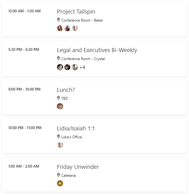
This is default rendering of the agenda control:
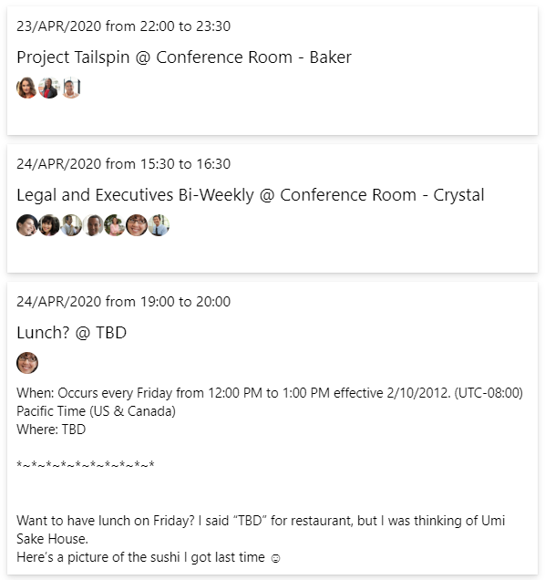
And we want to change the template to show more details like:
- Display of event dates and time;
- Clickable title to directly access the calendar via web link;
- Show the participants;
- Show the description of the event.
This is the result after using custom templates, custom CSS, and JavaScript:
Implementation
Each component can have multiple modifiable parts. You can use data-type to specify which of the many templates to modify.
In this case, we customized 3 templates: event view, no-data view, and loading view and we will focus on modifying event template.
<mgt-agenda>
    <template data-type="event">
        <!--
    </template>
    <template data-type="no-data">
        <p class="noData">
            There are no events found!
        </p>
    </template>
    <template data-type="loading">
        <p class="loading">
            Loading...
        </p>
    </template>
</mgt-agenda>
To show a customized date and time using the event template, you need additional functions that can be called directly from the template. To do this you can take advantage of the templateContext JavaScript property present in each Toolkit component, that allows you to extend the context of the template with your variables, functions, and events.
const months = ["JAN", "FEB", "MAR", "APR", "MAY", "JUN", "JUL", "AUG", "SEP", "OCT", "NOV", "DEC"];
document.querySelector('mgt-agenda').templateContext = {
    openWebLink: (e, context, root) => {
        window.open(context.event.webLink, '_blank');
    },
    getDate: (dateString) => {
        let dateObject = new Date(dateString);
        return dateObject.setHours(0, 0, 0, 0);
    },
    getTime: (dateString) => {
        let dateObject = new Date(dateString);
        return dateObject.getHours().toString().padEnd(2, '0')
            + ':' + dateObject.getMinutes().toString().padEnd(2, '0');
    },
    formatDate: (date) => {
        let dateObject = new Date(date);
        return dateObject.getDate()
            + "/" + months[dateObject.getMonth()]
            + "/" + dateObject.getFullYear();
    },
    getTextFromHTML(htmlString) {
        var doc = (new DOMParser()).parseFromString(htmlString, "text/html");
        return doc.body.innerText;
    }
}
Now you have a series of functions that format dates (getDate, getTime, formatDate), a function to open the link to access the web calendar (openWebLink), and a function to extract the text from an HTML string (getTextFromHTML).
To refer to the data to be displayed in the template, you can use a data-binding expression using double curly brackets like {{ event.subject }} b. You can also use the data-props attribute. It allows you to add an event listener or set a property value directly in your templates. You can add an event handler by using the “@eventName” syntax like @click: openWebLink.
<template data-type="event">
    <div class="event">
        ...
        <div class="event-title" data-props="{{@click: openWebLink}}">
            {{ event.subject }} @ {{event.location.displayName}}
        </div>
        ...
         <div class="event-description" data-props="{{innerHTML: event.body.content}}" />     ...
    </div>
</template>
In this example the first div will show two properties of the event: subject and displayName and a click event is hooked to our openWebLink function previously defined. The second div will show the body property of the event.
You can also use data-if and data-else attributes to be able to pilot the rendering with conditional expressions:
<template data-type="event">
    <div class="event">
        ...
        <div data-if="getDate(event.start.dateTime) == getDate(event.end.dateTime)"
      class="event-subTitle">
            {{formatDate(event.start.dateTime)}}
            from {{getTime(event.start.dateTime)}}
            to {{getTime(event.end.dateTime)}}
        </div>
        <div data-else class="event-subTitle">
            {{formatDate(event.start.dateTime)}} ({{getTime(event.start.dateTime)}})
            -
            {{formatDate(event.end.dateTime)}} ({{getTime(event.end.dateTime)}})
        </div>
        ...
    </div>
</template>
In this part of the template you can see how the data-if attribute is used with an expression that uses one of the functions defined in the templateContext: getDate. The expression checks to see if the start date is the same as the end date. If it is, it displays the content of the div. Otherwise it displays the div containing the data-else attribute. In both cases, other previously defined helpers are used to format the data to display.
The last implemented part of the template is the one related to the visualization of the attendees:
<template data-type="event">
    <div class="event">
        ...
        <div class="event-attendees">
            <mgt-person data-for="attendee in event.attendees"
                        person-query="{{ attendee.emailAddress.name }}"
                        person-card="hover" />
        </div>
        ...
    </div>
</template>
Here you can use one of the toolkit controls, mgt-person, to view the details of the users. The data-for attribute allows you to cycle through data collections, such as users, and then display lists of data in the UI. In the expression there is a definition of a variable, attendee, which represents the current object during the cycle. It is possible to use the $index variable in expressions to refer to the element index or the $parent variable to access the context of the parent data, even if in this example they are not used.
Final Component using Templates
When we put together the snippets described above using the Playground or your web project, the result is this:
HTML
<mgt-agenda>
    <template data-type="event">
        <div class="event">
            <div class="event-subTitle"
   data-if="getDate(event.start.dateTime) == getDate(event.end.dateTime)">
                {{formatDate(event.start.dateTime)}} from {{getTime(event.start.dateTime)}} to
                {{getTime(event.end.dateTime)}}</div>
            <div class="event-subTitle" data-else>
                {{formatDate(event.start.dateTime)}} ({{getTime(event.start.dateTime)}}) -
                {{formatDate(event.end.dateTime)}} ({{getTime(event.end.dateTime)}})
            </div>
            <div class="event-title" data-props="{{@click: openWebLink}}">
                {{ event.subject }} @ {{event.location.displayName}}
            </div>
            <div class="event-attendees">
                <mgt-person data-for="attendee in event.attendees"
      person-query="{{ attendee.emailAddress.name }}"
                            person-card="hover" />
            </div>
            <div class="event-description" data-props="{{innerHTML: event.body.content}}" />
        </div>
    </template>
    <template data-type="no-data">
        <p class="noData">
            There are no events found!
        </p>
    </template>
    <template data-type="loading">
        <p class="loading">
            Loading...
        </p>
    </template>
</mgt-agenda>
JavaScript
const months = ["JAN", "FEB", "MAR", "APR", "MAY", "JUN", "JUL", "AUG", "SEP", "OCT", "NOV", "DEC"];
document.querySelector('mgt-agenda').templateContext = {
    openWebLink: (e, context, root) => {
        window.open(context.event.webLink, '_blank');
    },
    getDate: (dateString) => {
        let dateObject = new Date(dateString);
        return dateObject.setHours(0, 0, 0, 0);
    },
    getTime: (dateString) => {
        let dateObject = new Date(dateString);
        return dateObject.getHours().toString().padEnd(2, '0')
            + ':' + dateObject.getMinutes().toString().padEnd(2, '0');
    },
    formatDate: (date) => {
        let dateObject = new Date(date);
        return dateObject.getDate()
            + "/" + months[dateObject.getMonth()]
            + "/" + dateObject.getFullYear();
    }}
CSS
.event {
    box-shadow: 0 3.2px 7.2px 0 rgba(0,0,0,.132), 0 0.6px 1.8px 0 rgba(0,0,0,.108);
    margin: 10px;
}
.event-title {
    cursor: pointer;
    font-size: var(--event-subject-font-size, 19px);
}
.event, .event-title, .event-subTitle, .event-attendees, .event-description, .noData, .loading {
    padding: 5px;
}
.noData, .loading {
    font-family:  "Segoe UI", "Segoe UI Web (West European)", "Segoe UI", -apple-system, BlinkMacSystemFont, Roboto, "Helvetica Neue", sans-serif;
}
Conclusion
We’ve introduced you to the power of customizable templates. We’ve shown you how to mix HTML elements with other Toolkit controls or with external web components, and how easy it is to adapt them to your needs. Now you can explore the infinite customization possibilities of toolkit components without having to re-implement the controls.
Stay tuned with the series and share our articles using #MSGraphToolkitLap. Next up: The power of mgt-get!
 Light
Light Dark
Dark