
A Lap around Microsoft Graph Toolkit Day 3 – Microsoft Graph Toolkit Components
Author: Fabio Franzini, Microsoft Office Development MVP
Welcome to Day 3 of the Microsoft Graph Toolkit blog series!
In this blog post we walk through the Microsoft Graph Toolkit Playground, a website where you can view and test toolkit components directly online without having to create a real project. It also gives you an overview of components available in the latest version of the Toolkit (version 1.2).
Playground
Let’s start this third day by talking about the Playground. This tool is extremely helpful for beginners who want to follow along and explore all the components with us.
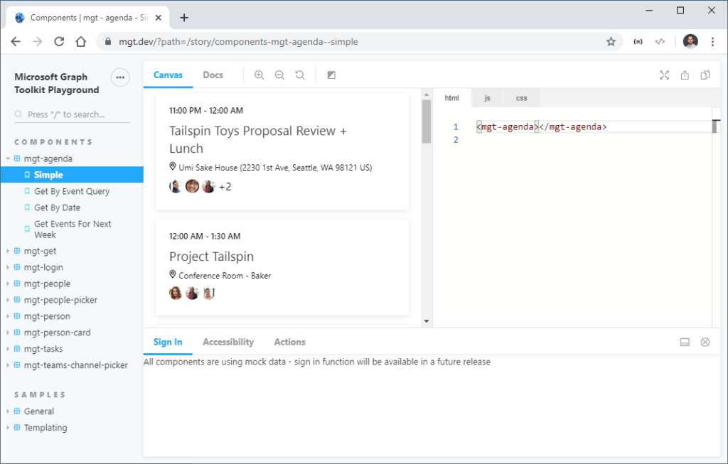
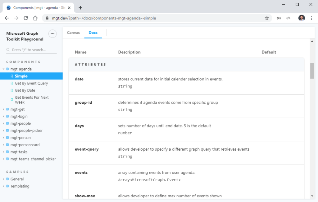
The Playground is divided into sections. The navigation part on the left allows you to select various components and examples for each component. The canvas in the middle lets you both view the components and change the HTML markup, JavaScript, and CSS. In this way we can add the attributes that correspond to the properties of the component or vary the graphic appearance using the CSS properties, etc. You can click on the Docs tab to find descriptions of the attributes, properties, and CSS properties of each of a toolkit component. You will find this useful later as we look at each component and their out-of-box attributes, properties, and CSS properties.
Components
Now let’s look at the core part of today’s blog: Components. As we discussed in our previous posts, Microsoft Graph Toolkit offers the possibility of having a set of controls that are at the same time easy to use and powerful.
Imagine you are building an app that allows your customer to create a meeting. You want a functionality to convert meeting agenda items to Microsoft Planner tasks. You want a people picker to choose people from the customer’s organization. You want to show a list of people that are invited… You will need to learn to connect to Microsoft Graph. You write your own auth code and try to figure out which auth flow to go with. And worst of all… you need to make everything look pretty. You could spend several weeks coding! What if I tell you Microsoft Graph Toolkit could change your weeks of work into less than an hour?
Microsoft Graph Toolkit offers mgt-agenda component that shows you a calendar view. You can add mgt-people-picker component to choose people from your organization. You can display a person’s photo and name by using the mgt-person component. You can group people together and show the list with mgt-people component. You can hover over the person component and see the mgt-person-card component with detailed information. You can create, complete, and delete tasks using the mgt-tasks component. You now can even pick a Teams channel you are part of to send a reminder to everyone who are invited to this meeting with mgt-teams-channel-picker component! Now you don’t need to make any graph calls yourself. Just add these components to the page and they will magically work together at the same location. Don’t believe me? Check out this screenshot of application I made from 5 minutes of coding in the playground:

The other components in the toolkit are: mgt-login, which displays a button and flyout to facilitate Microsoft identity platform authentication; mgt-get, which allows you to make your own Microsoft Graph get queries.
Each component has a set of HTML attributes, CSS custom properties, JavaScript properties and events so you can customize according to your . The toolkit also allows users to customize components using a template feature. This way we can reuse the logic of the component itself while also having the ability to change it from a graphic point of view, not bad! We will only list some of the possibilities here in this post. You can find more detailed examples in Day 4 article.
Now let’s take a closer look at the two components we added, mgt-login and mgt-agenda, during day 2 blog post. We will list all the relevant information you would find useful when building on top of Microsoft Graph Toolkit components. This way, you know what to look for in the rest of the components. Remember to utilize the playground and docs to help explore the components.
Login
The login component (mgt-login) serves to manage the phases of authentication, display of the current user, and logout. This component exposes a property (userDetails) that represents user details and some events to manage the various phases of authentication.
An example of markup is this:
<mgt-login></mgt-login>
Graphically it consists of two states:

When a user is not signed in, the control is a simple button to initiate the sign in process.
When user is signed in, the control displays the current signed in username, profile image, and email (through the mgt-person control). When you click the login component, a flyout will open with a command to sign out.

In order to run correctly it needs the following permissions at Graph API level (based on the endpoints to be called):
- User.Read
- People.Read
- Contacts.Read
- User.ReadBasic.All
There are no attributes or properties other than user-details (userDetails), which allows you to pass the user object directly without using an authentication provider. You can try this out by adding the following code to js tab in the playground mgt-login page:
let loginControl = document.getElementById('myLoginControl');

loginControl.userDetails = { displayName: 'Fabio Franzini', email: 'fabio@contoso.com', profileImage: 'url' }
There are also several events and functions that allow you to manage or modify the control creation process.
You can personalize the way to render this control using the following methods:
- renderButton: used to render the button chrome
- renderButtonContent: used to render the button content
- renderFlyout: used to render the flyout chrome
- renderFlyoutContent: used to render the flyout content
- hideFlyout: used to dismiss the flyout
- showFlyout: used to display the flyout
- toggleFlyout: used to toggle the state of the flyout
The following events are very helpful when you want to be notified as the state changes:
- loginInitiated: cancelable event fired when user clicked the sign in button to start the login process
- loginCompleted: fired when login process was successful, and the user is now signed in
- loginFailed: fired when user canceled the login process or was unable to sign in
- logoutInitiated: cancelable event fired when the user started to logout
- logoutCompleted: fired when user signed out
For more details about this control visit this page: https://docs.microsoft.com/en-us/graph/toolkit/components/login
Agenda
With the Agenda control, using the mgt-agenda element, we can view a user’s agenda or a group’s calendar.
Using this markup, for example:
<mgt-agenda group-by-day days="2"></mgt-agenda>
We can view the agenda, grouped for the next 2 days:

This control needs to have the Calendars.Read permission to work properly and contains many attributes, making it extremely configurable:
- date: JavaScript Date String that represents the start date of the events to fetch from Microsoft Graph;
- days: number of days to fetch from Microsoft Graph, with 3 as a default value;
- show-max: number to indicate the maximum number of events to show;
- group-id: string ID for a group calendar to use instead of the current signed in user’s calendar;
- event-query: string that represents an alternative query to be used when fetching events from Microsoft Graph. By using this attribute, the date and days attributes are not used anymore;
- events: array of events to get or set the list of events rendered by the component – use this property to access the events loaded by the component. Set this value to load your own events;
- group-by-day: Boolean value to group events by day.
- Among all the most interesting is the event-query attribute that allows you to indicate any endpoint graph that allows you to return events. In this way we can apply filters and sorts and show the data we want, for example:
<mgt-agenda event-query="/me/events?orderby=start/dateTime"></mgt-agenda>
It will show the events of the person currently logged in, ordering them by start date.
For this control there is only one event, eventClick, fired when the user clicks or taps on the event item in the agenda, but there are a lot of method to personalize the rendering of the control, each one for a specific part of the control: renderLoading, renderNoData, renderGroups, renderHeader, renderEvents, renderEvent, renderTitle, renderLocation, renderAttendees, renderOther.
For more details about this control, visit this page: https://docs.microsoft.com/en-us/graph/toolkit/components/agenda
Now that we have looked at these two components, you can go to our documentation to take a look at the attributes, properties, custom events, and CSS properties available for the rest of the components.
Final Summary
In this blog post we talked about a few things.
At the beginning we saw the Microsoft Graph Toolkit Playground https://mgt.dev/. It is a great tool that allows you to visualize and test every single component without the need to create a real project. Use it especially at the beginning to familiarize yourself with the controls and especially if you do not yet have an Office 365 tenant where you test your code.
As a reminder, you can create a Microsoft 365 tenant for development purposes completely free of charge here: https://developer.microsoft.com/en-us/microsoft-365/dev-program.
We also saw an overview of Microsoft Graph Toolkit components and went into details of two of the controls: mgt-login and mgt-agenda. For further details on attributes, properties, custom events, and CSS properties available for the other controls you can refer to the official documentation available here: https://docs.microsoft.com/en-us/graph/toolkit/overview.
Check out the rest of this series and help us spread the word with #MSGraphToolKitLap. Our next blog post on April 23rd will show you how to customize toolkit components with your own styles and functionality!
 Light
Light Dark
Dark