
Developing a custom action for Kaizala
Kaizala ships with many actions out of box allowing you to get work done within the context of a conversation or group [read more]. Few of them are surveys, quick poll, request location, announcement, etc. But there could be a case(s) where these are not sufficient for your business or requirements and you may want to build your own action. Kaizala platform allows you to extend the client side functionality through custom actions (or cards). There are 2 ways you can create a custom action:
- Customizing templates present in Kaizala management portal (demonstrated in Part A of Flow scenario pos)
- Build or code a custom action
In this post we will explore option #2 – Building a custom action!
Before we begin building a custom action, we will need to understand what an action / card is composed of, few concepts around the flows and various screens in a card (called views), the life-cycle of an action. As a pre-requisite, I would recommend you have played and are familiar with few actions that are shipped out-of-box with Kaizala – atleast survey and announcement. Below are the sections into which this post is organized into:
- Overview of custom action progammability
- Action card screen flows
- Components of an action package
- Action package life-cycle
- Building a custom action
- Testing and debugging
- Publishing an action
Lets get started!
Overview of custom action progammability
Kaizala platform provides developer an action package SDK (called KASClient.js) – which is a javascript library that abstracts out platform specific functionality and provides a way to interact with the underlying Kaizala runtime. The developer could build a custom action in HTML / JS / CSS by calling into the SDK. A custom action is a zipped bundle of few HTML/JS/CSS files, manifest files and KASClient.js – the action package SDK (more details in section to follow). Below picture gives an idea of where the custom action fits in and its interaction.
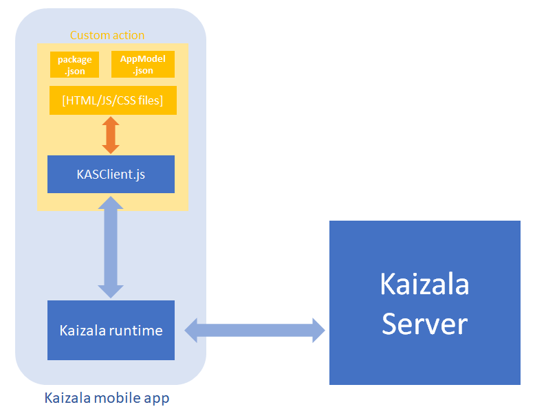
Legend:
- Blue blocks – provided by / part of Kaizala platform
- Blue arrows – implicit actions, that happen subsequently as a consequence of a call from / to the SDK
- Yellow block – action package
- Orange blocks – files handcrafted / coded by developer
- Orange arrow – calls made by developer’s code into SDK
Action card screen flows
An action / card has a couple of screens / views of which some are mandatory while others are open to the customization by the developer. Below are the list of views in a card:
- Discover view
- Creation view
- Chat canvas card view
- Response view
- Response results view
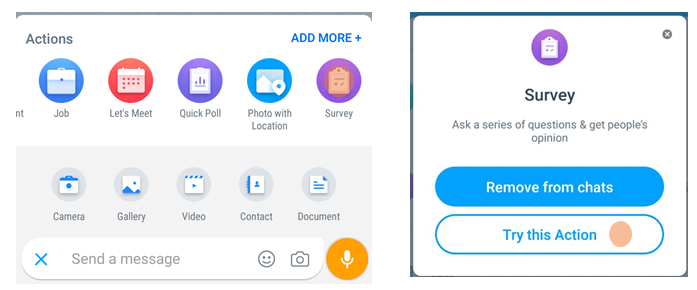
For showcasing the different views, I have picked the out-of-box survey action.
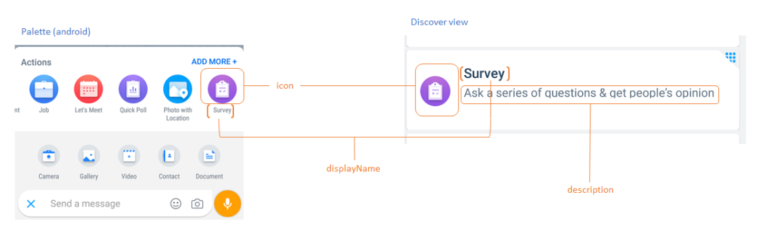
Discover view
Discover view is not a view actually but just the entry point to the action. It mainly consists of the icon, display name and description and appears in the palette and discover screen. Below screenshot gives an illustration. The configuration / customization options for a developer for this view are the 3: icon, displayName and description that get into the package manifest (package.json) file.
Creation view
Creation view is launched by tapping on the action either from the palette / “try this action” from the discover screen.
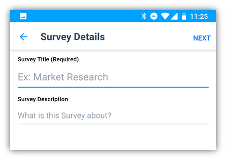
Following is a screenshot of survey action’s creation view where user is asked for the title, description of the survey. Filling these details and submitting creates a survey in the group. This view can be developed using HTML / JS / CSS.
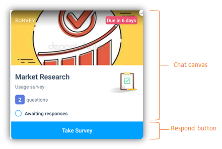
Chat canvas card view
The chat canvas card view is the card that appears on the group when a card / form is submitted. Below is a screenshot of the survey chat canvas card view. The survey chat card is a native view and can be customized using a declarative JSON schema (detailed here).
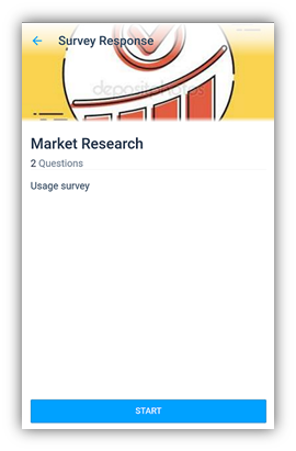
Response view
Response view is the view that comes up on tapping the respond button on the chat card. In the survey example, it brings up the view that takes in the response for the survey. Below screenshot shows the survey response view. Response view can be customized / developed in HTML / JS / CSS.
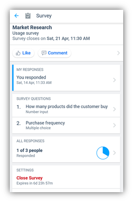
Response Results view / Summary view
The response results view / summary view comes upon tapping the chat canvas area of the chat card view. In the survey example, it brings up a view that shows the response count and ways to drill down to the responses. Below is a screenshot that shows the survey results view. Response results view can be customized / developed in HTML / JS / CSS.
The creation view, response view and response results view are also called as immersive views.
Components of an action package
An action package is a zip file that contains package manifest file – package.json, KASClient.js, html view(s) and resources.
package.json
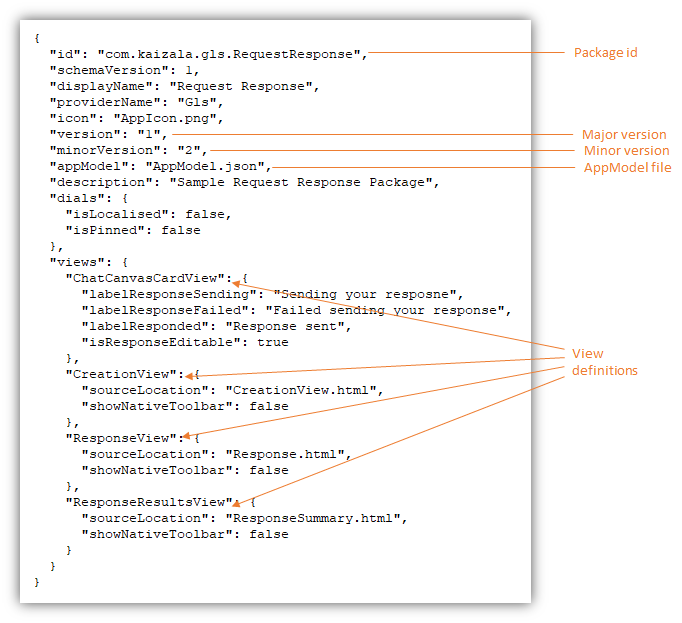
The package.json is the package manifest file that has the configuration details for the action package and should be in the root folder of the action package. This file is mandatory without which package upload would fail. The package manifest schema has been documented here. Below screenshot gives an example of package.json file.
App Model file
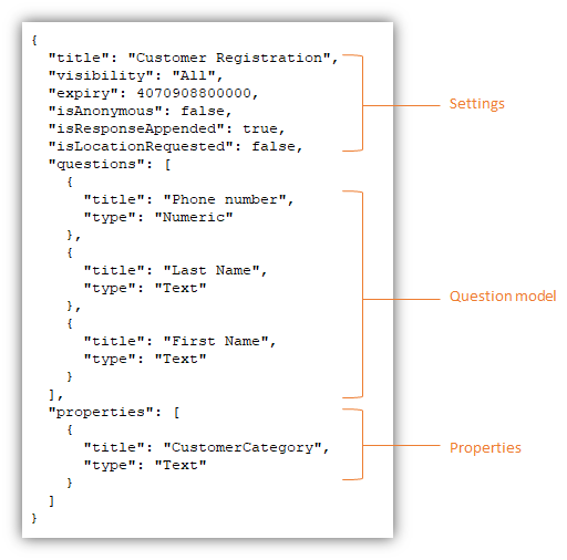
App model contains the question / answer model, properties and settings corresponding to the card. Like, the data you would like to capture while an user responds using the card. The developer could choose the name of the app model file but has to be specified in package.json. The schema for app model file can be found here. Below is a sample app model file.
Action package SDK / KASClient.js
The action package SDK / KASClient.js file also needs to be a part of the action package. The methods / functionalities exposed by the SDK are consumed by the immersive views (creation / response / response results views) and are translated to native platform specific calls by the Kaizala runtime. The SDK can be downloaded from https://manage.kaiza.la/MiniApps/DownloadSDK. The Microsoft documentation for KASClient.js can be found here.
Action package life-cycle
An action package has 5 states: Draft, Staged, Active, Inactive, Removed. Below diagram shows the interactions / operations that takes an action package across the various states.
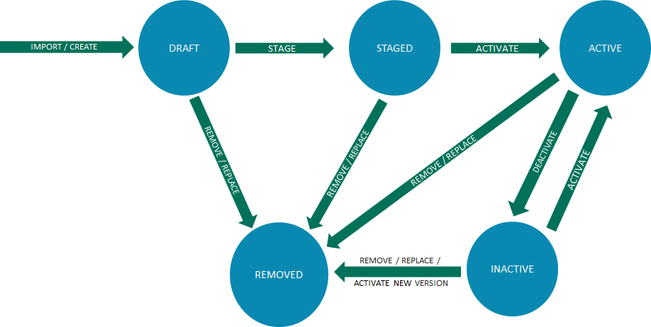
Significance of various states
- Draft: cannot be used / associated to any group.
- Staged: A state for testing and debugging purposes. Can be associated to a group, but will show up with [STAGED] labeling.
- Active: At this stage action package is ready for consumption / in production
- Inactive: A state where action package cannot be associated with any new groups. (the package will continue to work in the groups where it has already been associated with)
- Removed: at this state, the action package will cease to exist in all the groups with which it was associated earlier and will also not be available for association with any other groups. You will not be able to re-activate it either.
Building a custom action
To build a custom action, you will need an editor. Notepad would do, Visual Studio works great. In the interest of keeping this post brief, I will not get into the details of building an action. You can follow this tutorial present on Microsoft documentation to get started with building your own custom action. It takes you step by step from creating the package manifest and app manifest to creating the various views as well as publishing the action using the Kaizala management portal.
Testing and debugging an action
In order to debug an action package, it needs to be in the staged state. Debugging is possible using the chrome web tools debugger for the immersive / HTML views. Pre-requisites: Windows PC with a chrome browser and an android phone with Kaizala installed and part of the group where the action package is associated and in staged state. Open the view you want to debug and navigate to chrome://inspect/#devices in Chrome browser. The view you want to debug should be listed there. Click on inspect from the list of pages.
For details refer the documentation here.
Hope that was helpful. If you need more details / anything is unclear, feel free to let me know through the comments. Thank you for reading!
 Light
Light Dark
Dark