
Today, we’re excited to announce the release of a brand-new version of the Microsoft Graph Toolkit! We first introduced Microsoft Graph Toolkit over a year ago in September 2019, and since then, we’ve seen incredible adoption and an amazing response from the developer community and our partners. Our team has been hard at work taking the feedback and requests we’ve received and turning them into the exciting new features we’re sharing with you today.
As a recap, the Microsoft Graph Toolkit is a collection of components and providers that makes your integration with Microsoft Graph as easy as writing two lines of code. If this is your first time hearing about Microsoft Graph Toolkit, you can learn more by reading our documentation or by trying one of our getting started guides.
Updating your application
To update your application to use the newest version of Microsoft Graph Toolkit, navigate to your project directory and run:
npm i @microsoft/mgt@latest
If you’re using the Toolkit via mgt-loader, your application will be automatically updated to the newest version.
This update includes minor breaking changes that may impact your application, such as deprecation of properties and naming updates to CSS custom properties. Please go to our release notes to see a detailed list of the changes.
What’s new in 2.0?
New packages
Previously, Microsoft Graph Toolkit was available as a single package containing all components and providers. As Microsoft Graph Toolkit grows, we recognize that you may not use everything in your application and you should be able to include only the code you need. We’ve split Microsoft Graph Toolkit into the following packages:
Core
- @microsoft/mgt-element – The core package that contains only the base classes used to build components and providers. This package exposes all necessary classes and interfaces needed to build your own components and exports the IProvider interface and SimpleProvider class for building custom providers.
Providers
- @micosoft/mgt-msal-provider – Contains the provider to authenticate web apps and PWAs using MSAL.js.
- @microsoft/mgt-sharepoint-provider – Contains the provider for authenticating in a SharePoint environment.
- @microsoft/mgt-teams-provider – Contains the provider to authenticate Microsoft Teams tab based applications using MSAL.js.
- @microsoft/mgt-proxy-provider – Contains the provider for application that proxy Graph calls through a backend service.
Components
- @microsoft/mgt-components – A package with all Microsoft Graph connected web components.
Main
- @microsoft/mgt – the main package that contains all components and providers in a single convenient package.
React wrapper for Microsoft Graph Toolkit
We’ve also added a new @microsoft/mgt-react package. This library makes it simpler to use Microsoft Graph Toolkit when developing React applications by wrapping all components and exporting them as React components. To use it, install the package:
npm i @microsoft/mgt-react
Import a component:
Import {Person} from ‘@microsoft/mgt-react’;
and use it anywhere in your JSX like a regular React component:
<Person personQuery=”me”>
Read more on how to use mgt-react on our GitHub or try out our newly improved React guide.
New Components
Person Card 2.0
We’ve redesigned and added new features to the Person Card component so that you can easily display more information about a person. The new Person Card displays additional profile information, such as skills and interests, a person’s organizational chart, relevant conversations and files shared between the signed-in user and a person, and more. Try it out now on our component playground!

To Do
With the release of the new To Do API on Microsoft Graph, we’ve also created a new To Do component. Our original Tasks component has been split into mgt-todo and mgt-tasks, which use the To Do and Planner APIs respectively. Try out the new To Do component on our component playground.
Keep your eye out for even more improvements to the To Do component as well as more exciting new components in coming 2.x releases!
New Features and Improvements
Caching of Microsoft Graph calls
We’ve added an optional, configurable caching feature to minimize the number of requests your application needs to make. This will help improve both the loading performance and user experience for your applications, especially when you’re using multiple components. To learn more about how to enable and configure the cache, visit our caching documentation.
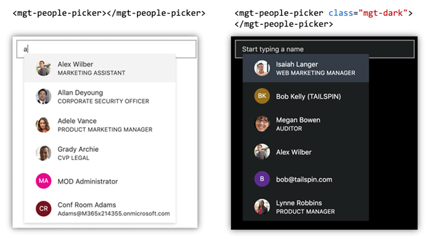
Theming
One of the goals of Microsoft Graph Toolkit is give developers flexibility to customize the components as needed. To make this even easier, we’ve added theming capabilities. Now, you can easily switch between light and dark themes per component, regionally, or even globally. You also have the ability to create your own customized theme or modify the themes we’ve provided. Check out these theming examples to see it in action!
Localization and Accessibility
We’ve also started working on support for web accessibility standards in the Toolkit components. With this release, we have enabled easily configurable string localization as well as right-to-left rendering. To see how you can use these features, check out this sample.
Bug Fixes and Improvements
This update also includes a plethora of bug fixes and improvements that aren’t specifically highlighted in this post. To see the full list, check out our release notes.
We’re looking forward to hearing your thoughts and feedback on this new release. Please submit any bugs, feature requests, and feedback by opening an issue in our Github repository.
– The Microsoft Graph Toolkit team
0 comments